
CyberScript
Client:
Self-initiated
Credit:
Alex Li (Qiuyu Li)
Year:
2024


Description:
CYBERSCRIPT is a futuristic typeface defined by sharp cuts, angular forms, and straight lines, embodying the precision and aesthetic of advanced machinery. Inspired by the fragmented nature of digital information, its sliced design elements reflect the dynamic energy of a data-driven world. The bold geometry of its structure seamlessly combines machine-like rigidity with a forward-looking sensibility, making it ideal for evoking cybernetic environments and futuristic concepts. Whether used in technology branding, cyberpunk visuals, or smart device promotions, ”CYBERSCRIPT” delivers a strikingly modern presence that bridges the gap between the digital and the visionary.
The 12 Eternal Castles Series Posters
Client:
Self-initiated
Credit:
Alex Li (Qiuyu Li)
Year:
2025



Description:
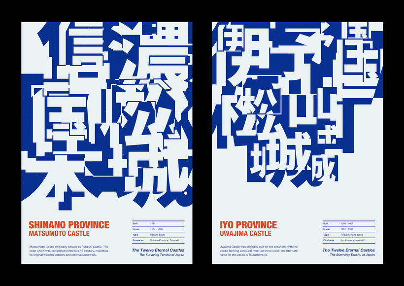
" The 12 Eternal Castles" poster series is an experimental work that merges the aesthetic beauty of Japanese castle architecture with typography. Japanese castles developed alongside advances in civil engineering. Each castle took advantage of Japan’s mountainous terrain, resulting in irregular layouts and unique structures, heavily influenced by the surrounding environment and geographical conditions. This series explores new possibilities in typography by focusing on the castles' irregular layouts and integrating them with letterforms. The design captures the castles’ uneven levels—shaped by the mountainous landscapes—through variations in the size and structure of the typography. Though the design is two-dimensional, it incorporates a sense of space. This approach emphasizes the cultural significance of Japanese castles while also highlighting the structural beauty and cultural value of typography.
Awards:
-
2025, (Netherlands) Indigo Design Award 2025, Gold Winner
Variations of Heart Whispers
Client:
Self-initiated
Credit:
Alex Li (Qiuyu Li)
Year:
2024


Description:
This series of posters portrays the gradual evolution of one person's admiration for another through the progressive transformation of Chinese characters' forms. Admiration is not something that occurs in an instant, but rather a step-by-step process of emotional change. Therefore, this series of posters depicts five stages of Chinese character form transformation, transitioning from stability to turbulence, and from clarity to chaos, effectively conveying the development of this emotion. The entire series adopts a three-act structure, namely Heartbeat, Daydream, and Irresistible, and with each act, the emotion gradually intensifies, progressing from the initial heart-throbbing moments to daydreaming, culminating in an irresistible and uncontrollable passion. In each act, the form of the Chinese characters undergoes five levels of transformation, ranging from subtle to intense, interpreting the process of emotional change. This series of works elucidates the fluctuations and transformations of human emotions, providing a concept and form of expression for typography.
Awards:
-
2024, (U.S.) New York Type Directors Club(NY TDC) Award 70, TDC Winner
-
2024, (Swiss) MA-g Awards 2024, Winner(Ed Fella MA-g Award)
-
2024, (France) DNA Paris Design Awards 2024 (Graphic Design/Typography), Winner
-
2024, (France) DNA Paris Design Awards 2024 (Graphic Design/Key Art), Winner
-
2024, (U.S) Muse Creative Awards 2024, Silver Winner
-
2024, (China) Xi`AN TDC Award 2023, Nomination Award
-
2025, (Korea) The 3rd B.I. International Poster Art Biennale, Selected
Hearing Extraordinary Dream Inc. Logo
Client:
HEDD Inc.
Credit:
CD: Han Yu. AD, D: Alex Li (Qiuyu Li)
Year:
2024


Description:
The origin of Chinese characters can be traced back to pictographic characters, which often retain their pictorial features in their forms. When designing the logo for a music-related company, fully embraced the pictographic nature of Chinese characters. The core concept revolved around "sound" and "audio sources." The textual elements were crafted using visual elements symbolizing "ear" and "sound waves." By leveraging the characteristics of pictographic characters, our aim was to create a logo type that resembles an emoji, allowing people to grasp the essence of the company's business to some extent even without reading Chinese characters. This inspiration from the origin of Chinese characters brings a unique and culturally meaningful visual expression to the logo, combining the rich history of Chinese characters with the music industry.
Awards:
-
2024, (Italy) A` Design Award & Competition 2024, Bronze Winner
-
2024, (U.K) London International Creative Competition(LICC) 2023, Finalist
-
2024, (U.S) IDA Design Awards 2023(International Design Awards), Honorable Mention
72 Seasons (Book)
Client:
Published Works
Credit:
Alex Li (Qiuyu Li)
Year:
2025




Description:
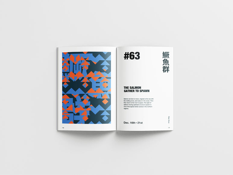
"72 Seasons" is a seasonal system that originated in ancient China, dividing the 24 solar terms into periods of five days to represent natural phenomena, plants, and animals. In this visual book, information about the 72 seasons is depicted using kanji characters, geometric elements symbolizing nature, and a variety of colors. Kanji not only symbolizes culture and history but also functions as a visual element. This visual book aims to give kanji a visual impact, treating it not just as something to be read but as a form of visual art.
-
Language: English
-
Binding: Paperback
-
Size: 229x152mm (9×6 inches)
-
ISBN: 978-1-304-02783-2
-
Imprint: Lulu.com
Awards:
-
2025, (U.S.) Muse Creative Awards 2025, Gold Winner
Posters Project #04
Client:
Self-initiated
Credit:
Alex Li (Qiuyu Li)
Year:
2024~2025



Description:
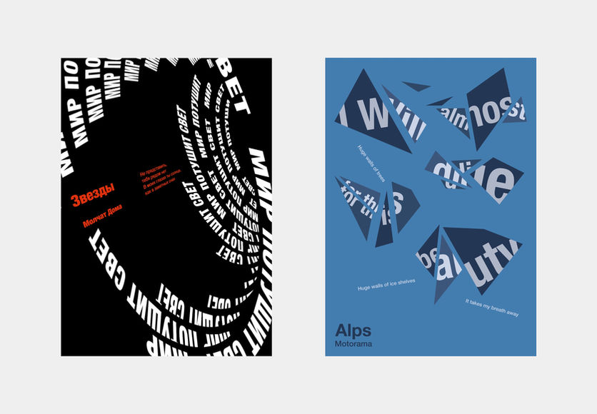
This collection focuses on the emotional forms of typography. These posters use type as the primary medium of expression, exploring the warmth and tension of letters on the visual level.
Among them, “Alps” constructs a sense of melancholic romance through fragmented letterforms; some works take a public-interest perspective, echoing the theme of kindness and having been exhibited in Fight for Kindness.
In addition, “Malevich 145 Y.O. ” was designed to commemorate the anniversary of Kazimir Malevich’s birth. The work combines a nostalgic and retro visual style with a certain degree of experimentalism, paying tribute to this pioneering artist.
Awards:
Alps
-
2024, (Russia) Golden Bee 16 Global Biennale of Graphic Design, Global Poster Language, Selected
-
2023, (U.S) Poster Stellars 3rd Intercontinental Poster Competition United States 2023, Selected
Звезды (Stars)
-
2025, (U.S) Poster Stellars 5th Intercontinental Poster Competition United States 2025, Finalist
-
2024, (Russia) Golden Bee 16 Global Biennale of Graphic Design, Cyrillic Time, Selected
-
2024, (Argentina) Intercontinental Bienal 2024, Selected
Kindness is Simple
-
2025, (Korea) The 3rd B.I. International Poster Art Biennale, Selected
-
2024, (India) Typography Day Poster Competition 2025, Winner
Malevich 145 Y.O.
-
2024, (Russia) FORM=MEAN Exhibition and Competition, Winner
When nothing is left, is love still hard?
-
2025, (Korea) The 3rd B.I. International Poster Art Biennale, Selected
Shanghai Shadows
Client:
Self-initiated, Photography
Credit:
Sophia Wang (Xiqiong Wang)
Year:
2023


Description:
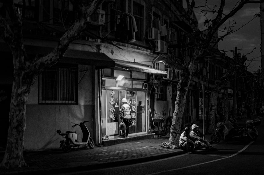
In the shadows of Shanghai's gleaming skyscrapers and bustling streets, there exists a stark and sobering reality. My photographs capture the lives of the homeless and manual workers who inhabit the peripheries of this rapidly developing metropolis. These individuals, often overlooked and marginalized, are the invisible backbone of the city's progress. Through my lens, I aim to shed light on their struggles and resilience, highlighting the human cost of urban advancement. Each image tells a story of survival and strength, depicting the harsh conditions they endure while contributing to the city's relentless growth. My work seeks to bring visibility and voice to those living in the shadows, ensuring that their stories are not forgotten in the rush towards modernization.
Awards:
2025, (International) Annual Photography Award 2024, Honorable Mention
Hundred Poems Fragrant Tale
Client:
Self-initiated
Credit:
Alex Li (Qiuyu Li) & Sophia Wang (Xiqiong Wang)
Year:
2025



Description:
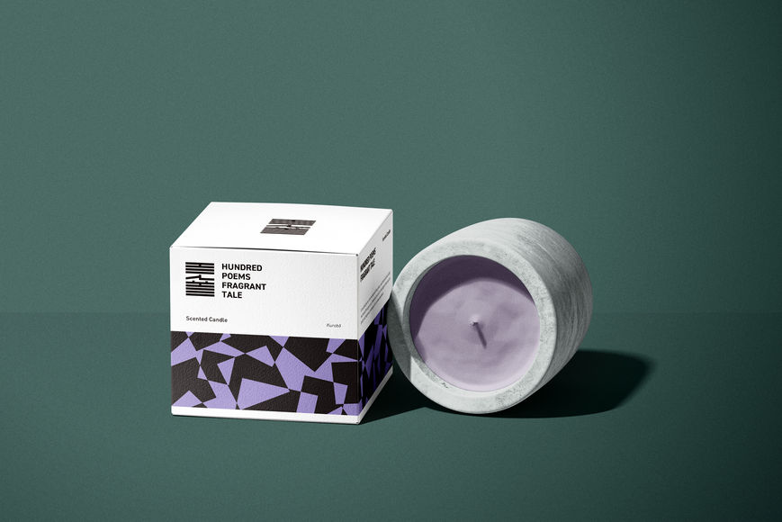
This work is an independent conceptual design project envisioning an incense brand inspired by Hyakunin Isshu, the classical anthology of one hundred poems. The concept explores the relationship between poetry and fragrance, conveying emotion through scent.
The logo is derived from Kō no Zu, the traditional incense diagram used in Japanese Kōdō, symbolizing the fusion of fragrance and culture. The packaging design draws on traditional Japanese patterns, where varied motifs and color schemes distinguish each scent and poetic theme, reflecting a refined sense of Japanese aesthetics in a contemporary context.
Posters Project #03
Client:
Self-initiated
Credit:
Sophia W. (Xiqiong Wang)
Year:
2025


Description:
This collection continues to focus on social and public-interest themes. “Familiar Strangers” examines the conflicts within parent-child relationships and social issues related to children’s growth.
In addition, the collection includes posters exploring cultural topics and more playful themes, resulting in content that is lively, diverse, and visually engaging.
Awards:
Familiar Strangers
-
2025, (U.S) Poster Stellars 5th Intercontinental Poster Competition United States 2025, Silver Winner
Black Seeker
-
2025, (U.S) Poster Stellars 5th Intercontinental Poster Competition United States 2025, Finalist
Kronso Design Festival 2025
-
2025, (Poland) International Poster Biennale Lublin 2025, Selected
Future Flares
-
2025, (U.S.) LA Design Festival 2025, Design Futurism, Shortlist
Hand in Hand
-
2025, (country) Award, Selected
String Game
-
2025, (country) Award, Selected
Forma
Client:
Self-initiated
Credit:
Alex Li (Qiuyu Li)
Year:
2024


Description:
This typeface is inspired by Russian Constructivism, focusing on the interplay between geometry and functionality. With its minimalist composition and bold color contrasts, Forma embodies the power of avant-garde art while merging the classical and the contemporary.
Utopian City Ver2.0
Client:
Self-initiated
Credit:
Alex Li (Qiuyu Li)
Year:
2022



Description:
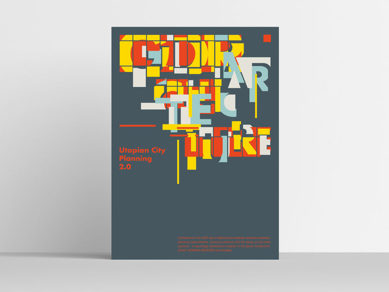
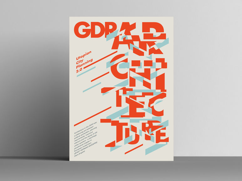
The typography of this poster is based on the referencing of architectural structures. It explores new possibilities in typographic design through adjustments in the relationships between the letters, variations in size, and morphological transformations, while merging them with architectural elements.
Awards:
-
2023, (Italy) A` Design Award & Competition 2023 (Concealed Categories), Iron Winner
-
2023, (U.K) London International Creative Competition(LICC) 2022, Winner Best in ILLUSTRATE(Graphic)
-
2023, (U.S) IDA Design Awards 2022(International Design Awards), Bronze Winner
-
2023, (France) DNA Paris Design Awards 2023 (Graphic Design/Typography), Winner
-
2023, (France) DNA Paris Design Awards 2023 (Graphic Design/Key art), Winner
-
2023, (U.S) Poster Stellars 3rd Intercontinental Poster Competition United States 2023, Selected
-
2023, (International) C-IDEA Design Award 2023, Design Award
-
2023, (Germany) Red Dot Award Design Concept 2023, Shortlist to final round
-
2023, (U.S) Young Ones ADC (Art Directors Club) 2023, Shortlist to final round
The Whisper of Water
Client:
Self-initiated
Credit:
Sophia Wang (Xiqiong Wang)
Year:
2025


Description:
This series uses Chinese onomatopoeic characters to capture the varied sounds and forms of water. From the subtle 滴滴答答 (drip-drop), through the gentle 淅淅沥沥(pitter-patter), to the rushing 哗啦哗啦 (torrent), these works compose a visual and auditory symphony of water.
By transforming the characters and manipulating space, the Chinese script transcends static signs to become flowing carriers of sound and emotion, inviting viewers to resonate with both natural rhythms and inner tides.
Posters Project #02
Client:
Self-initiated
Credit:
Alex Li (Qiuyu Li)
Year:
2022~2023


Description:
This collection focuses on the kinetic and expressive forms of typography. These posters present the motion and emotion of letters with a strong visual impact.
Most of the works relate to emotional or personal themes; while tinged with melancholy, they retain a sense of strength and order—intense yet restrained, emotional yet rational.
As a whole, this group of posters seeks a balance between sensitivity and reason, using the dynamic forms of type to shape emotional tension.
Awards:
No Alarms and No Surprises
-
2023, (U.S) Poster Stellars 3rd Intercontinental Poster Competition United States 2025, Silver Winner
-
2023, (Japan) Japan Typography Annual 2024, Selected
Freak
-
2023, (U.S) Poster Stellars 3rd Intercontinental Poster Competition United States 2023, Selected
-
2023, (Japan) Japan Typography Annual 2024, Selected
Super Mario
-
2023, (U.S) Poster Stellars 3rd Intercontinental Poster Competition United States 2023, Selected
Future
-
2023, (Japan) Japan Typography Annual 2024, Selected
Fade
-
2023, (Japan) Japan Typography Annual 2024, Selected
Doma Molchat
-
2023, (Japan) Japan Typography Annual 2024, Selected
Kamui Whisky
visual identity
Client:
Kamui Whisky K.K.
Credit:
AD, D: Alex Li (Qiuyu Li)
Year:
2025




Description:
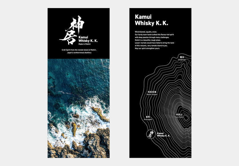
This visual identity was created for a whisky distillery located on Rishiri Island, Hokkaido. The design adopts the island’s topographic map as its core visual element, transforming regional uniqueness into a symbol of the brand. The island’s contours not only highlight the singularity of its origin but also convey the distillery’s commitment to expressing a distinctive flavor nurtured by nature.
Posters Project #01
Client:
Self-initiated
Credit:
Sophia W. (Xiqiong Wang)
Year:
2024~2025


Description:
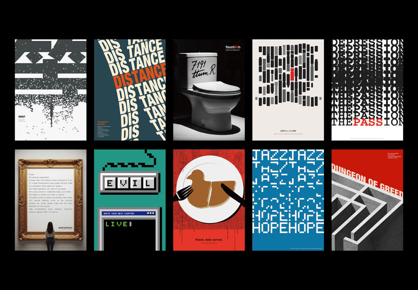
This collection centers on public-interest themes, with works that convey reflections and observations on social life, emphasizing a sense of social responsibility and using the poster as a medium for expression.
Several of these pieces have been exhibited in poster shows focusing on social and humanitarian causes.
Both “fountAIn” and “Masterpiece” experiment with the use of AI tools in their creation—representing a bold exploration of artificial intelligence within the design process.
Awards:
AWAIT
-
2025, (Korea) The 3rd B.I. International Poster Art Biennale, Selected
-
2024, (India) Typography Day 2025 Poster Competition, Winner
-
2025, (Turkey)International Goene Art Poster Exhibition, Seeing the Unseen,2025, Selected
The Dance of Distance
-
2025, (Brazil) Intercontinental Bienal 2025, Selected
FountAIn
-
2025, (U.S.) Future Frames Exploring AI in Creative Expression, Finalist
MASTERPIECE
-
2025, (U.S.) Future Frames Exploring AI in Creative Expression, Finalist
LOVE in I, I in LOVE
-
2025, (Korea) The 3rd B.I. International Poster Art Biennale, Selected
The Passion
-
2025, (Korea) The 3rd B.I. International Poster Art Biennale, Selected
Utopian City Planning
Client:
Self-initiated
Credit:
Alex Li (Qiuyu Li)
Year:
2021


Description:
Soviet modernist architecture is steadily disappearing with the dissolution of the Soviet Union. Apart from politics, it has significance to be recorded as a symbol of the times. This poster aims to document the culture of an era by rethinking the past and rediscovering new possibilities for the future.
Awards:
-
2022, (Italy) A` Design Award & Competition 2022, Bronze Winner
-
2023, (U.S) IDA Design Awards 2022(International Design Awards), Gold Winner
-
2022, (Netherland) Indigo Design Award 2022, Gold Winner
-
2023, (U.S) Creative Communication Award (C2A)2022, Best of Best
-
2022, (Japan) Japan Typography Annual 2023, Selected
-
2022, (U.S) Communication Arts Typography Competition 2022, Shortlist to final round
Dear Detective from RAMPO with love
Client:
NHK (Japan Broadcasting Corporation)
Credit:
CD: Segi Fumi. AD, D: Alex Li (Qiuyu Li)
Year:
2022


Description:
The design carefully selects a vintage-style bold Gothic font, reflecting the historical and cultural aesthetics of the era in the story's background. This choice evokes a sense of nostalgia while also incorporating modern design language. The bold Gothic font, with its strong strokes and structured form, embodies the themes of resilience and strength in the narrative, tightly linking visual language with storytelling.
The title of the TV series maximizes the emphasis on readability, ensuring that it can be efficiently communicated functionally. The combination of bold typography with a vintage style not only captures the audience's attention but also conveys the unique atmosphere of that era, creating a visual bridge between the past and the present. This design aims to resonate with the audience, evoking familiarity while immersing them in the distinct atmosphere of the series.
GOOD Fish & Chips
Client:
Self-initiated
Credit:
Alex Li (Qiuyu Li)
Year:
2024


Description:
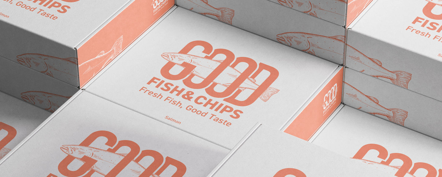
This packaging design aims to offer a simple yet impactful visual experience, featuring a friendly logo that combines the uppercase word "GOOD" with an illustration of a fish. The fish illustration is partially placed on the front and sides of the box, creating a puzzle-like design where multiple boxes can be arranged to form a complete image.
MARK`E Rolling 70 Main Visual
Client:
FM802, FMcocolo
Credit:
CD: Ryo Takahashi. AD, D: Alex Li (Qiuyu Li)
Year:
2022


Description:
Based on the theme of surfing and summer, this design closely aligns with the atmosphere of the music event, aiming to convey a sense of freedom, passion, and energy. The bright color scheme fully captures the warmth of the summer sun and the liberating spirit of surfing. At the same time, a slightly retro visual atmosphere, with a touch of 1970s elements, gives the overall design a nostalgic vibe, evoking memories of past beautiful summers. This design not only reflects the relaxed and joyful mood of the music festival but also complements the leisurely atmosphere of summer, inviting the audience to immerse themselves in it.
Client:
Osaka University of Arts
Credit:
CD: Yoshimaru Takahashi. AD, D: Alex Li (Qiuyu Li)
Year:
2022
Exhibition Poster


Description:
This poster, created for graduate students exhibition, employs fragmented and displaced text to generate spatial forms and a sense of depth. The visual expression reflects the graduate students’ deep exploration and multidimensional approach to knowledge. Two versions were developed: the Chinese version features vertical decomposition of characters to emphasize layering and profundity, while the English version uses horizontal decomposition to highlight extension and openness, echoing the inherent visual qualities of each language.
Experiment Logo #01
Client:
Self-initiated
Credit:
Alex Li (Qiuyu Li)
Year:
2020~2023


Description:
Experimenting with logo design is an excellent training opportunity for designers. By bringing ideas to life and designing innovative logos, designers can enhance their skills.
Awards:
Japanese Style Single Story Row House
-
2020, (Japan) Japan Typography Annual 2021, Selected
72 Seasons (Posters)
Client:
Self-initiated
Credit:
Alex Li (Qiuyu Li)
Year:
2022~2023


Description:
The 72-Seasons is a system of seasonal divisions of the 24 seasons into three five-day periods. Originally invented in ancient China, it was revised by Japanese almanac scholars in the Edo period (1603-1867) according to the endemic weather of the Japanese archipelago. This poster series is developed based on Japan's 72-Seasons conditions.
Awards:
-
2023, (U.K) London International Creative Competition(LICC) 2022, Shortlist
-
2022, (Japan) Japan Typography Annual 2023, Selected
Client:
Osaka University of Arts
Credit:
CD: Yoshimaru Takahashi. AD, D: Alex Li (Qiuyu Li)
Year:
2021
Art Exhibition Poster


Description:
This poster was created for an exhibition organized in 2021 by Osaka University of Arts and Hongik University in Korea. The intention behind the design was to create a new shape for the future through the exchange between the two countries. Visually, the poster blends cultural elements from both Japan and Korea, aiming to reflect the mutual inspiration and fusion of the two artistic traditions. Using modern design language and innovative forms, the exhibition conveys the profound significance of cultural exchange and collaboration, showcasing the collision and integration of different artistic perspectives in the context of globalization. This design is not only a tribute to past artistic traditions but also an exploration and expression of the possibilities for future art.
Awards:
2021, (Japan) Japan Typography Annual 2022, Selected
Zoo
Client:
Self-initiated, Photography
Credit:
Sophia Wang (Xiqiong Wang)
Year:
2022


Description:
This photographic series explores the tension between the natural world and the urban jungle. Intimate animal portraits reveal raw expressions of joy, peace, and freedom—glimpses of life untouched by human constraints—while contrasting images of city dwellers capture the fatigue and disconnection of rapid urbanization. By juxtaposing these realms, [Zoo] invites reflection on the pace of modern life and the possibility of greater harmony between humans and nature.
Posters about Vessel
Client:
Self-initiated
Credit:
Alex Li (Qiuyu Li)
Year:
2021


Description:
Kanji composed of dots and lines can be shaped like a container to visualized the meaning contained in the works, which can bring out a positive effect by propagating the culture of kanji.
Awards:
-
2021, (Japan) Japan Typography Annual 2022, Selected
-
2021, (International) C-IDEA Design Award 2020, Selected
Reconstruction Character
Client:
Self-initiated
Credit:
Alex Li (Qiuyu Li)
Year:
2021


Description:
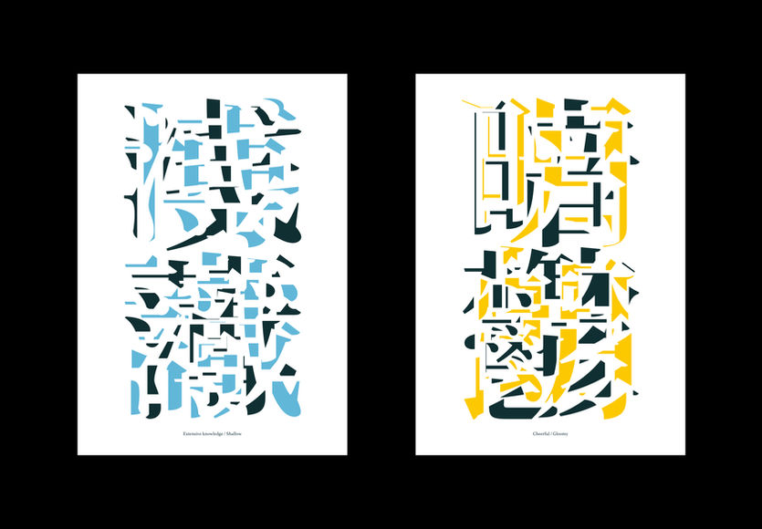
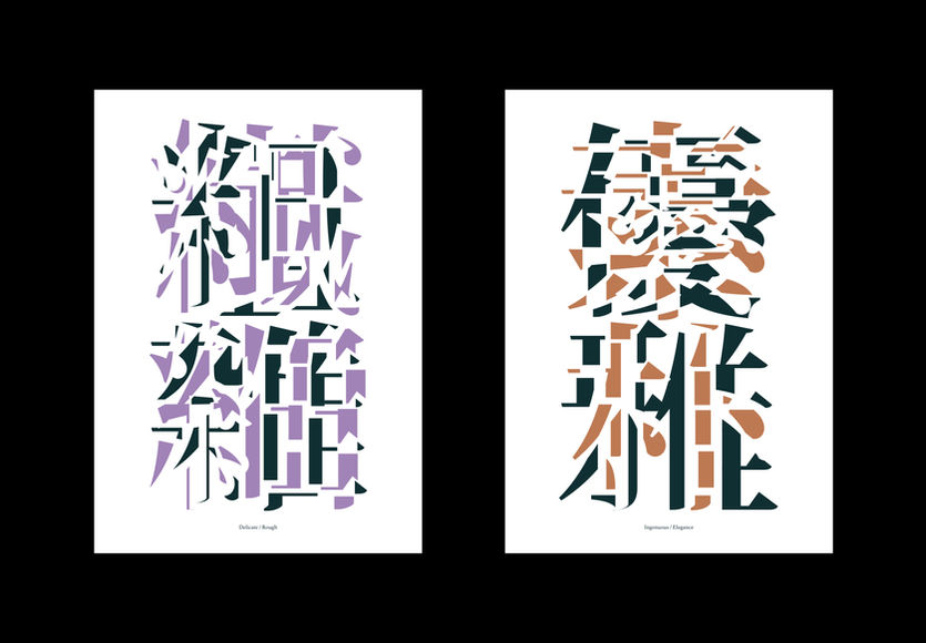
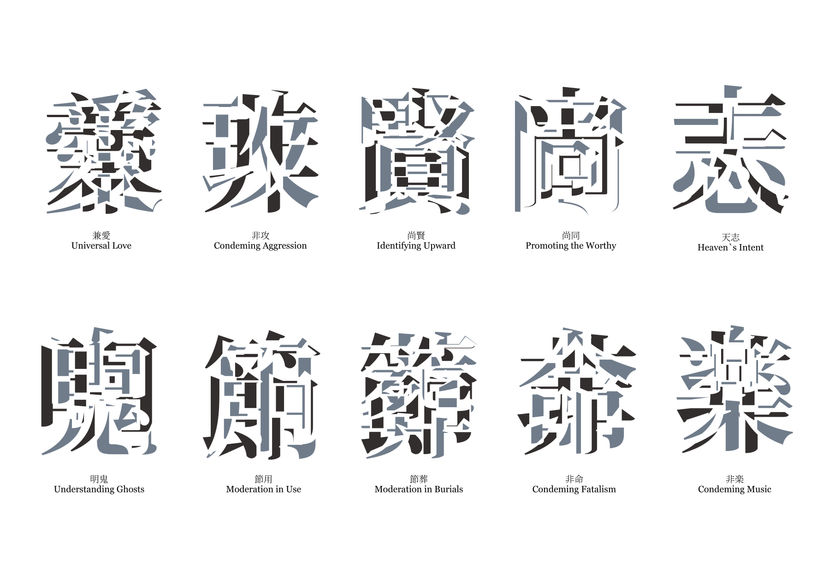
An experimental work that draws out new possibilities of expression through dismantling and restructuring by overlapping two kanji characters. I want to overlap the characters so that two characters can be seen at the same time.
Awards:
2021, (Japan) Japan Typography Annual 2022, Selected
The Physical Graphics
Client:
Self-initiated
Credit:
Alex Li (Qiuyu Li)
Year:
2020




Description:
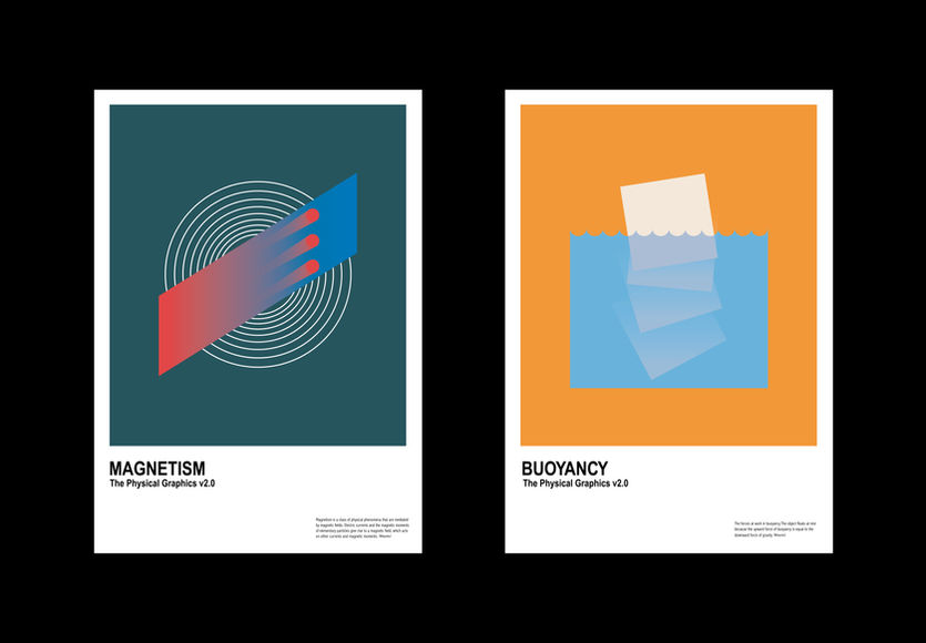
This poster series is inspired by physics, aiming to visualize the invisible forces that drive motion and the intangible energy behind them. Physics is not only a rational analysis of natural phenomena but also embodies a unique beauty hidden within its formulas and theories. Through geometric shapes, gradient colors, and dynamic compositions, this work transforms abstract energy flows and natural laws into a visible design language.
The series captures core concepts of physics, such as motion, waves, balance, and transformation, using minimalistic forms to convey the flow and inherent order of energy. It reveals the visual potential of science and opens up new possibilities for dialogue between science and art.
90s
Client:
Self-initiated
Credit:
Alex Li (Qiuyu Li)
Year:
2020


Description:
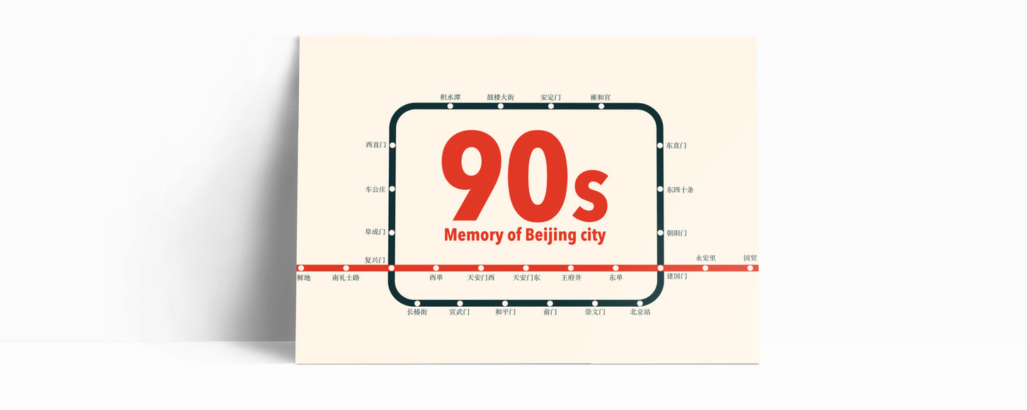
In the 1990s, China was coming out of a period of rapid growth, adopting an aggressive stance toward entering the international community. Children of that generation grew up experiencing international and local cultures simultaneously from a young age. They sought diversity and individuality, and were characterized by broader perspectives and unique values than previous generations. This postcard commemorates that era by expressing what they experienced and saw in their childhood.
Lactic Acid
Bacteria Powder
Client:
Self-initiated
Credit:
Alex Li (Qiuyu Li)
Year:
2020


Description:
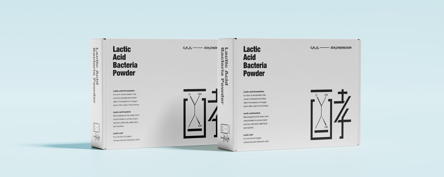
Package design study. This design is a package design about lactobacillus powder. The word "酵" is used as a visual element of the package, and the chemical formula is used as part of the text.